Carbon emissions reduced by 93% – How we made the ACCESS website more sustainable, accessible and inclusive
Published on 20 April 2026
ACCESS has a new website – one that is more sustainable (with carbon emissions reduced by 93%), more accessible, and more inclusive. In this blogpost, ACCESS Communications Officer Suzy Darke describes the redesign process and outlines the improvements that have been made.
Why did we redesign the site?
ACCESS is a large project with four workstreams, each comprising numerous projects and outputs. When our website was built at the start of the project, it was lean and compact. But as ACCESS grew in size and complexity, so did the site.
Although the ACCESS website has always run on 100% renewable energy via its UK-based web host, Krystal, our old website’s size made it energy intensive, with an average bandwidth of 20GB per month. (Bandwidth is the amount of data transferred between the server and the visitor’s device on loading a page and subsequently the amount of energy that servers, networks and devices use.)
Website pages had become overly long and difficult to navigate, so it was often difficult for visitors to find the fantastic work that ACCESS has done and funded. The site structure also made it difficult for us to get meaningful analytics about which content people were searching for, clicking on, and downloading.
Some elements of the website were not as accessible as we would have liked. And, for a project that’s all about people, there were very few pictures of the many humans that make up the ACCESS team and the wider ACCESS Network.
Our priorities
We had three priorities for our new website – we wanted to make it:
- more sustainable – improving energy efficiency and reducing the website’s digital footprint
- more accessible – removing any barriers that might prevent individuals from accessing or engaging with the content
- more inclusive – engaging with and welcoming a wide range of voices and viewpoints, including those of marginalised or underrepresented groups
These three priorities mapped clearly onto two of our three ACCESS Guiding Principles – Environmental Sustainability (ES) and Equity, Diversity and Inclusion (EDI). Less directly, we wanted the new website design to help raise the profile of the Knowledge Co-Production (KCP) work that ACCESS has funded through the FlexFund.
A note on synergies, tensions, and trade-offs
When it came to making improvements, we became very aware of the synergies, tensions and trade-offs between our three priorities (and their underlying Guiding Principles).
Several improvements satisfied more than one priority. Improvements in one area sometimes created knock-on improvements in another. For example, improving navigation to make the website more accessible and inclusive also led to energy efficiencies.
Other improvements to the website highlighted tensions between two or more of our priorities. For instance, we knew we wanted more photographs of people on the website, to make it feel more inclusive. But adding more images had the potential to impact the environmental sustainability of the new website. In such cases, we had to make compromises or trade-offs.
(For more on resolving tensions when considering the three Guiding Principles and making trade-offs, see How to use the Guiding Principles).
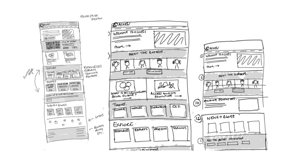
Sketches showing the development of our new homepage
The improvements
I worked with James Vine from the Multimedia Design Studio at the University of Exeter, who fully embraced the brief and delivered far more than we hoped for. I led on refining the website’s content while James rebuilt the website itself.
The following is a summary of the tools and improvements we have implemented. For more detail, see this comprehensive write-up of the ACCESS web redesign: How to build a more sustainable, accessible, and inclusive website: Reflections on the ACCESS web redesign
Sustainability:
- Compressing images to make pages faster to load
- Building a faster homepage that is 9x lighter than the previous one (around 700KB on first load, down from over 6MB)
- Streamlining content, menu navigation, site structure and search functionality so visitors can find the information they are looking for more quickly
- Making a whole host of ‘behind-the-scenes’ improvements to make the website load faster while transferring significantly less data across the internet
Accessibility:
- Adding an accessibility toolbar, allowing visitors to fully tailor their experience of the website, adjusting colour, font, line spacing, and more
- Improving navigation and site structure so that visitors can quickly find what they’re looking for
- Switching to more accessible web forms that are screen-reader compatible
- Adding image alt text to every image on the website to create a much better experience for visitors using screen readers
Inclusivity:
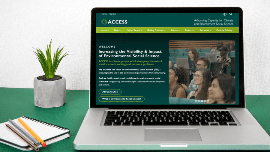
- Designing a more welcoming homepage with more images of ACCESS people on it
- Adding a rotating carousel of the ACCESS Network to the homepage to give more exposure to environmental social scientists and encourage more people to join the ACCESS Network
- Reordering the ACCESS Network page and improving the search function to make it easier to find members
- Improving the way outputs are showcased on the website, providing several ways to find content and increasing exposure for the project teams and their research
- Better organising blogs and news posts, making them more discoverable by people browsing the website
The results
We are delighted with the results of the redesign.
Our new website is exponentially more environmentally sustainable. We have reduced its carbon emissions by 93%, going from a Grade F to a Grade A+ on one independent testing platform.
(You can find a summary of our website’s sustainability statistics on the footer of our website, and a full breakdown of all optimisation results on this page. Both will be updated regularly.)
It feels and looks more inclusive and meets high accessibility standards – passing Web Content Accessibility Guidelines 2.0 Level AA.
The website is easier for visitors to navigate, and it’s easier for the ACCESS team to manage and extract meaningful data and analytics from it.
It also looks beautiful!
Lessons learned
Here’s what I learned from the experience:
- A good website (re)design is a collaboration between two knowledges – your understanding of what is important to your project, and your web designer’s skills and expertise.
- If you want to make real improvements to your website’s sustainability, accessibility, inclusivity and user experience, work with a web designer who is as excited as you are about making these changes.
- Don’t be afraid to ask for the seemingly impossible – a great web developer will often have a solution (or an even braver idea).
- Redesigning an existing website can feel like taking a well-loved jigsaw puzzle apart and attempting to rebuild a better picture from it – some of the pieces will be tricky to fit.
- Building your new website will likely take longer and be more iterative than you expect but stick with the process and you will have a better website for it.
How to build a more sustainable, accessible, inclusive website
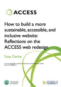
If you would like further information about building a more sustainable, accessible, and inclusive website, you can read this comprehensive guide to the full website redesign: How to build a more sustainable, accessible, and inclusive website: Reflections on the ACCESS web redesign
I couldn’t find much useful information when I was first exploring making these improvements, so I hope that other projects and research centres might find these reflections on the ACCESS experience useful.
This guide covers the website redesign process, testing, website sustainability, accessibility tools, inclusivity considerations, and integrating the ACCESS Guiding Principles into website design.
If you would like any further information, please email info@accessnetwork.uk